Weir Tings

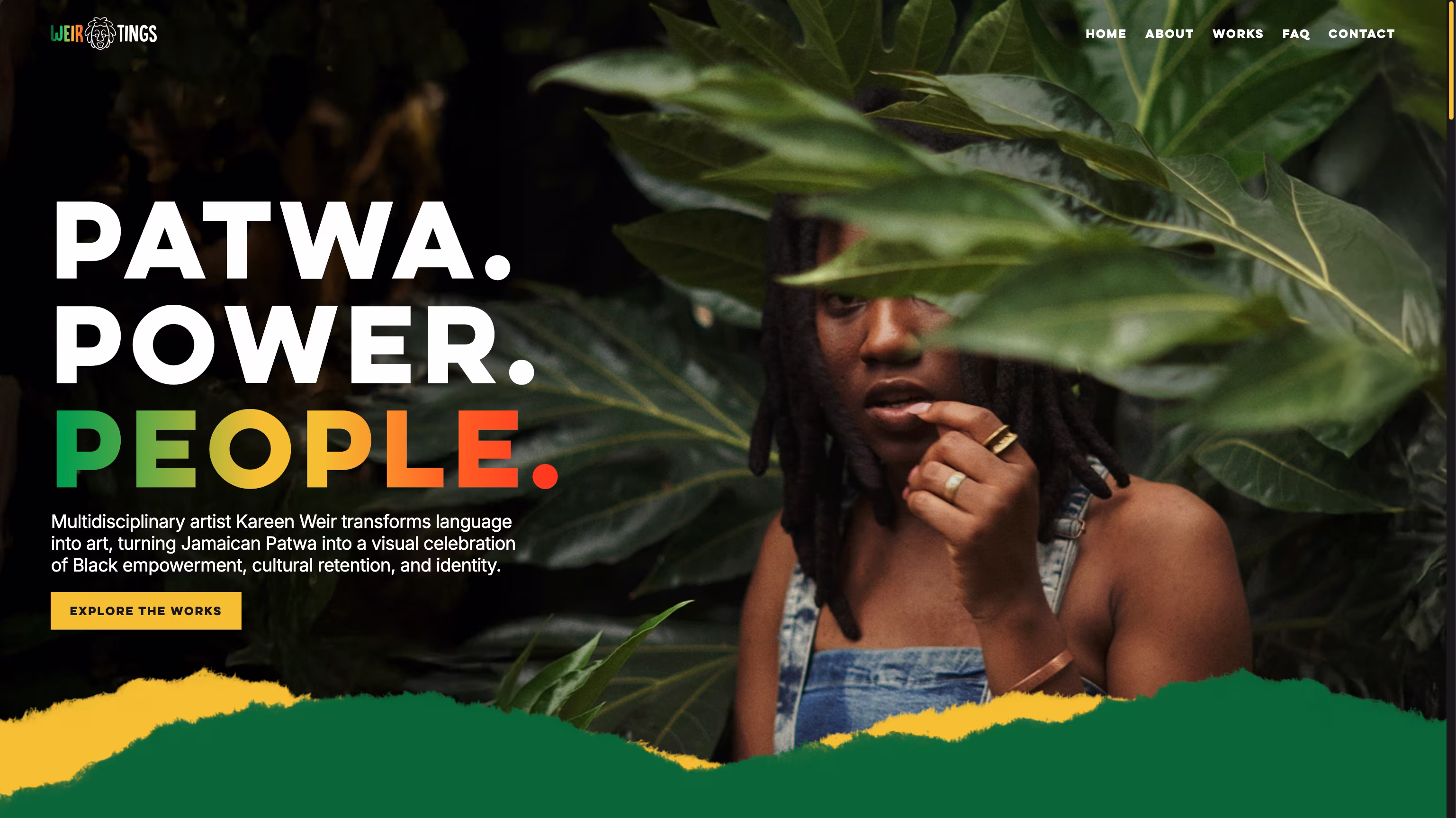
Patwa. People. Power.
Kareen Weir is a multidisciplinary artist who transforms language into art, specifically Jamaican Patois, turning everyday dialect into something unapologetic and collectible. She came to me with a clear problem: her existing site was outdated and no longer reflected where her brand had grown as an artist, entrepreneur, and creative force.
The project had branding and a style guide already in place, but we refined and simplified both so the design felt intentional without being visually overwhelming. Kareen also brought in illustrator Jowayne McFarlane, who created custom cartoon illustrations of her, and together we worked out how to weave them throughout the site in a way that felt natural and true to her world.

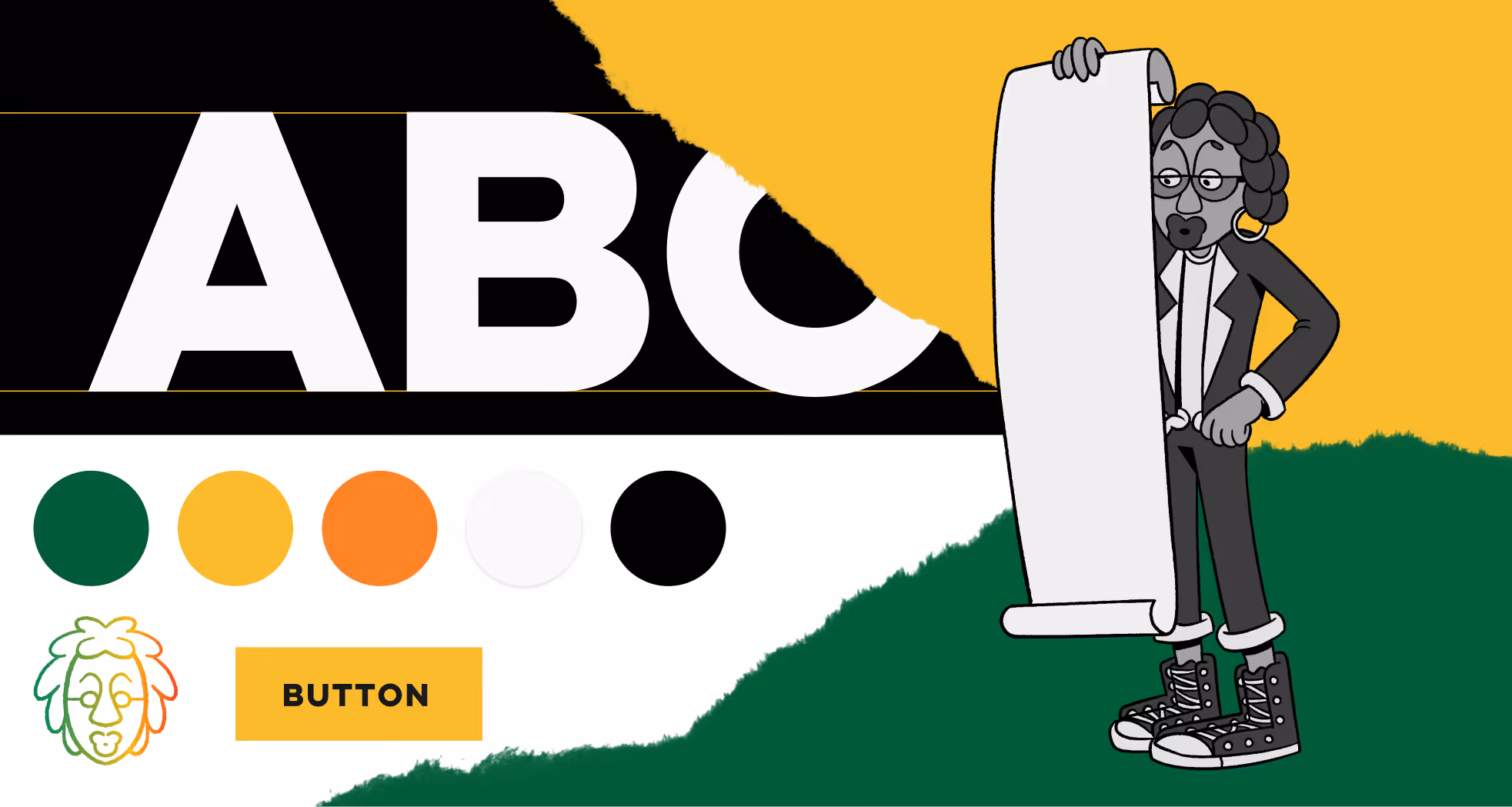
Unapologetic Expression
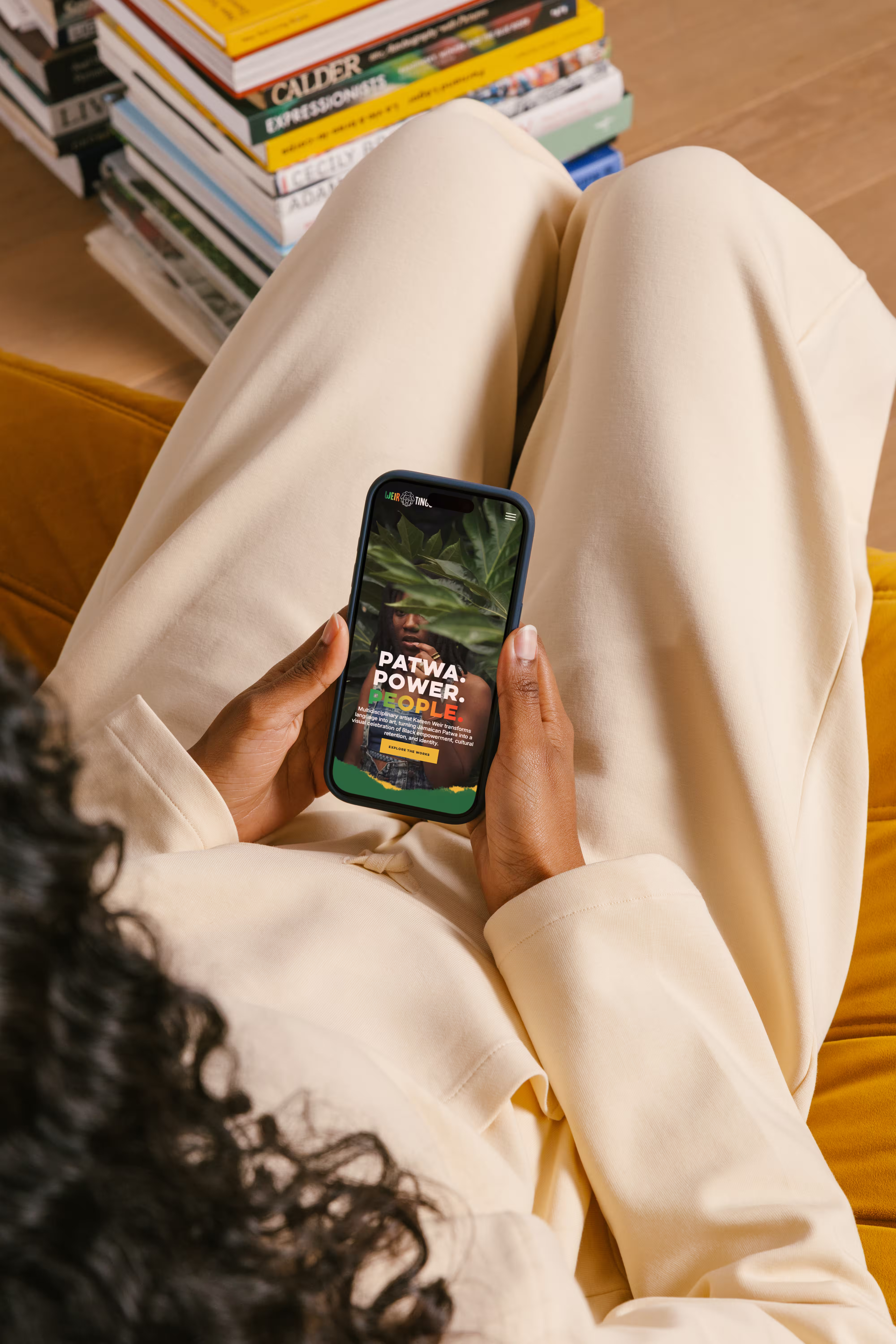
The original site was on Wix and had a template feel: busy, scattered, and not quite living up to the energy of Kareen's work. We wanted something more custom, more her - interactive, premium, and built around her illustrations and identity rather than a theme someone else designed. I recommended Webflow as the platform specifically for the creative flexibility and better content management it would give her long-term.
The main challenge was time and getting the content together, which meant staying nimble as the project evolved. As we got deeper into the design, we kept pushing the experience further - finding ways to make the site feel more alive and more interactive for anyone landing on it.
Still Growing
I led the redesign and development end-to-end, but this was genuinely a collaborative project. Kareen and I worked closely on specific design decisions, which made sense given that we're both creatives. Two things I'm particularly proud of are the preloader, which spotlights her favourite illustration with a simplicity that feels very her, and the page transitions, which I tested and refined through multiple rounds until they felt exactly right.
The response to the launch said a lot. Kareen was happy with the outcome, her colleagues complimented the site, and new inquiries came in as a direct result. We're still working together - the next phase will bring in an e-commerce side to continue growing what she's building.